Sunday 13 March 2011

Week 1

3rd MARCH 2011

Ruth Kirkland
- Design History Teacher.

I HAVE MY DICTIONARY PAGE ON THE RIGHT SIDE OF MY BLOG, FOR THE WORDS  LEARNT THROUGH THE COURSE

  • learnt about publishing a post.
  • went through course outline.
  • Library visit.
  • briefed on Ass.1 ,, "RESEARCH PRESENTATION"
                                               - a ten-minute class presentation of a prominent designer aligned with a particular design movement. The Presentation should be supported with visuals and a 1500 word report of research findings. Choose a designer with a high profile so there's plenty of material to research and show how that designer contributed significantly to the 'visual language' of the time and how he/she worked.                                 
 - Due Week 4 .                         20% 
  
 - This blog/journal  summary of notes and research.             Week 3, 9 & 12              60%

Assessment 1. Designer Research

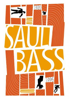
SAUL BASS

- Late Modern Art Movement

*Went home researched a lot about him, and collected photos.


Saul Bass influenced a lot of people designers, such as Kuntzel Deygas title screen for "Catch Me If You Can"

Week 2

10th MARCH 2011


The Different Movement's of Design History.

Victorian Movement


Arts & Crafts Movement (1830-1900)
Art Nouveau (1890-1910)


-Went through these movements taking notes.

Victorian Movement

1.  EARLY  
  • very symmetrical.
  • lost of different fonts on the same page.
  • curvy fonts, patterns.
  • very architectural.
  • the work was always filling up the whole page; breaks the rules of having white space.
  • ribbons, banners common theme. (very popular).
             example: - "COCA COLA LOGO" 
                                curvy, wavy. Banner style, borders.


2.  MID

  • less clutter on page.
  • motion in type placing.
  • more racy - woman showing her ankle. 
             example:- "BUDWEISER"  
                                "LEVI'S"
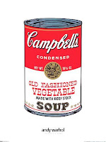
                                "CAMPBELL'S SOUP" 
                                "DIESEL"


-NOTE: ROY LICHENSEIN*


1. LATE (1910)

  • writing is the same.
  • clearer format.
  • neater.
  • fine lines.
  • simplified / geometric shapes.


Arts & Crafts Movement (1830-1900)

"Arts & Crafts Movement, was a motion against the poor aesthetic quality of the industrial Revolution in GREAT BRITAIN."

  • UNITY in artwork- Lifts the bridge between the Victorian and Modern Artists/Designers.
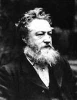
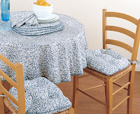
  • WILLIAM MORRIS* - Leader of the Arts & Crafts.  Craftsmenship. The bridge to MODERNISM.
  • Rebelling against Industrial / Factory Work.
  • Co-ordinated patterns. Unlike Victorian Era where it was all over the place patterning.
  • William Morris loved patterns. 
  • More natural looks, not as symmetrical.

 -used pigskin*


Art Nouveau (1890-1910)

  • direct descendant of ARTS & CRAFTS MOVEMENT.
  • looks better.
-cont. week3*

Week 3

17th MARCH 2011

ART NOUVEAU (1890-1910)

*NOUVEAU- means new art. Direct descendant of "ARTS & CRAFTS" 


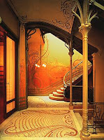
*VICTOR HORTA - influences


 - organic style, natural, light soft curves, no sharp edges, plant-like.
- unified, sweeping things. 
                                                 FEMININE      Female Oriented.
                                                 ELEGANCE    Stencil work.


*1898, hand-carved, timber, on chairs, handles, etc; fine details.
 -Influenced by Japanese style, because of Europe & Asia Trades.
-Vincent VanGogh


*JULES CHERET - lithographer


- invented life-size (7 foot tall) posters.
-He was influenced by Japanese Art. Abstract shpae, silhouettes.
-Female form, with text. Like japanese block works, outlined in black.
-theme is 'DANCING' on posters.
" FATHER OF THE WOMANS LITIGATION" 
- ( Looking happy, drinking & smoking) .
-uses diagonals
- blending the bright & dark areas of work together.

*PIERRE BONNARD


-Pierre Bounard & Toulouse-Lautrec influenced off each other.
-Silhouette, hand-drawn. Good balance, females.
-The Illusionist - art nouveau style influence


*TOULOSE-LAUTREC


-French painter, print maker, illustrator
-capturing people in their working environment, using colour, movement.


*ALPHONSE MUCHA


-Czech Art Nouveau painter, and decorative artist
-Work featured beautiful young women, with flowing features, neo-classical looking robes, luscious flowers, and halo features behind their heads.
-Used pastel colours , very different poster makers of his time.


SIXTIES PSYCHEDELIA 1960-1975

having the vivid colours and complex patterns popularly associated with the visual effects of psychedelic states

*Psychedelia drugs, tripping out.
*Work with - 
  • coloured lines
  • bright colours
  • vibrating lines
  • high intensity
  • optical illusions
 - just like art nouveau except for the colours.

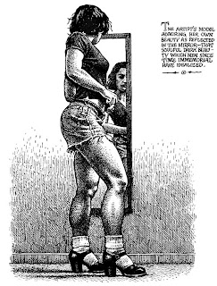
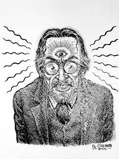
*ROBERT CRUMB


*pre-witch, racy, sexual.
*Rolling Stones
- Andy Warhol (writing had a melting look)
*If you could read it, it wasn't cool enough.
*The writing was printed like a pattern (wave). 


*BOB DYLAN POSTERS


  • PEACE
  • MONKEY
  • ROCK-ON

EARLY MODERNISM 1910-1935
-beginning of modernism


*Modern & Contemporary are different.
*CONTEMPORARY MEANS NOW!
*Avante-garde are early modern artists.

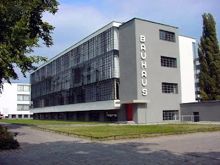
*BAUHAUS 

- Geometry, simplicity. square, geometric, circle. PRIMARY COLOURS!

*Early modern covers a multitude of art
  • realism
  • expressionism
  • constructivism
  • futurism
  • surrealism
  • dada
  • new typography, etc.
THE MODERN LABEL IS OFTEN APPLIED WHEN THERE IS A DELIBERATE BREAK WITH THE PAST.
*Henry Ford said "You can have any colour, aslong as it's black." 

*PICASSO


*cubist art "OSKAR KUKOSCHKA"


*GERMAN EXPRESSIONISM.
-Bold lines
-abstract
diagonals


*POSTER ART
- Putting one item on the poster only.
-DE STIYL , -one image one text.


*THE HERO IS THE POSTER!


*FUTURISM


*a celebration of machinery.
*An artistic movement originating in Italy around 1910 whose aim was to express the energetic, dynamic, and violent quality of contemporary life, especially as embodied in the motion and force of modern machinery.


*DADA


*A nonsense movement.
*rebellious era
*mocking art.
*A European artistic and literary movement (1916-1923) that flouted conventional aesthetic and cultural values by producing works marked by nonsense, travesty, and incongruity.


*CONSTRUCTIVISM


-red, black,white
-san serif
-diagonal
-purist movement


*Lissitzsky Constructivism

*BAUHAUS & CONSTRUCTIVISM

*Influences in a lot of cubism.
-bauhaus a leaning place.


Week 4

24th MARCH 2011
EARLY MODERNISM 1910 - 1935


-Avante garde - the front line, bravery of trying something new.


MOVEMENTS

  • bauhaus
  • constructivism
  • dada
  • de styl (poster art)
  • expressionism
  • heroic realism
  • new typography
  • surrealism
  • vorticism
  • plakstil

*Modernists were in love with geometry and despised ornament.

[PIA MONDRIAN]


*Expressionists - concerned about human connection, deep empathy, for poor social outcasts.


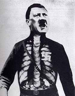
h/w look up the first photomontages JOHN HEARTFIELD


*Bauhaus influenced Constructivism and vice-versa 
- tilted axis
-colour scheme


***I HAD TO LEAVE HALF WAY THROUGH THE CLASS AS I HAD TO CATCH A PLANE TO QUEENSLAND

JOHN HEARTFIELD


John Heartfield (19 June 1891, Berlin – 26 April 1968, East Berlin) is the anglicized name of the German photomontage artist Helmut Herzfeld. He chose to call himself Heartfield in 1916, to criticize the rabid nationalism and anti-British sentiment prevalent in Germany during World War I.  [Wikipedia ]


Week 5


31st March 2011

D.HISTORY EXCURSION TO THE POWERHOUSE MUSEUM


We went to the PowerHouse Museum as an excursion. we had a great time. even though the two exhibitions we were meant to see were either finished or closed. The Art Deco Exhibit and the 80s art exhibit.
We were at the powerhouse museum so we decided to explore the whole museum, my favourite section was the new photography exhibition and the fashion design area.
We too clots of photos and ate amazing PIES =]

Week 6

PRESENTATION CLASS 1 

I was in the first group of people to do their presentations and hand in their essay on a designer.

My Essay part of Assessment 1.


Saul Bass – Late Modern Movement
Late Modern Movement [1945-1970]
-
The Late Modern Movement started after the Modernism period; unlike Modernism, Late Modern Art was created to challenge how people view political and biblical ideas, instead of being told what to believe and do, people started to rebel and voice out their opinions, whether it’s through words or art. Breaking through the mould and contradicting what people thought was art, and creating work that challenged previous art movements. During this era, there was a lot of commercial pressure to create eye-catching designs to engage audiences to the purpose of the design piece.  

Late Modern was an era on Minimal Art that was influenced by the Cold War (1947-1991). From here a lot of international influences were used such as Japanese art styles; multiculturalism. Saul Bass was an icon during the Late Modern Movement, his posters and his film credit sequences flowed with a natural influence.

Saul Bass [1920-1996]
-
On the 8th of May 1920, a man by the name of Saul Bass was born. Bass was an American Graphic Designer famous for typography work, and filmmaking; not to mention he revolutionised the way people see title and credit sequences.  One of many famous artists who made the era different; Bass studied at “The Art Students League”(Manhattan) and Brooklyn College, and for a couple of years became an art director. He was well known for the way he made the opening of film credits more interesting to the audience, through typography and design. 

*In 1950, Saul Bass & Associates was opened.”

Saul Bass was one of the only people to realise how title sequences for opening and closing credits of films could affect an audiences idea of the film before it even starts, just like a poster. During this era, theatre films were becoming more popular to the mass of people.

At the first showing of one of his title sequence pieces, he made sure the curtains were up before the opening credits played catching audience members off-guard. It was so well received, that he began working on more.  His title sequence not only symbolised the idea of the film’s genre, but also summarised what the audience were to expect from the film. 

Saul Bass was greatly influenced by the artist Paul Rand’s idea about how there should be an equal balance between the use of asymmetrical shapes and spacing. However unlike Rand’s work, Bass kept his work very simple and evenly spaced his design work; instead of having a lot of contrasting through colour, shape and texture, Bass kept his designs minimal, centred and simple. 

“My initial thoughts about what a title can do was to set mood and the prime underlying core of the film’s story, to express the story in some metaphorical way. I saw the title as a way of conditioning the audience, so that when the film actually began, viewers would already have an emotional resonance with it.

 DESIGN IS THINKING MADE VISUAL.”  

Saul Bass


A lot of Bass’s work was influenced by the fine arts that were continuously used throughout the style eras in art.

Saul Bass even designed the poster for Steven Spielberg’s famous film, Schindler’s List.
Saul Bass was most famously known for his work on Otto Preminger’s 1955 film “The Man with the Golden Arm” becoming the “King of Title Design”.  His idea was just like Picasso ‘s hand-made style of work and Henri Matisse’s use of abstract composition through simple shape and spacing. Bass’s idea of Preminger’s 1955 film was to make it simple, bold, modern, and CREATIVE.

The Man with the Golden Arm [1955] 
Directed by Otto Preminger
-
For the film “The Man with the Golden Arm”, both Preminger and bass agreed on wanting the title sequence to be a summary of what happens in the film itself.
The movie is based on the story about how the main character a jazz musician and heroin addict named Frankie Machine (Frank Sinatra) who overcomes his addiction while in jail.
On the films poster, every little detail was thought of constructively everything was placed on the poster for a reason. The technique of placing type and imagery is used to express the themes throughout the film; giving the audience an idea of what the film is about.


The title, connected to the black rigged cut out of an arm, is used to show the struggle Frankie Machine goes through to conquer his addiction. The rigged hand is to map the struggles through coming out clean. The arm is bent in a compromising position to symbolise the idea of grabbing on for hope, reaching for support and there always being hope. The arm was placed in the central point of the poster, for the main attention and idea that arm is strength. 

The title and image of the arm in the centre is surrounded by black, purple and blue abstract rectangles to show imprisonment, being trapped. As the movie progresses on, you know that the struggles become easier for Frankie to conquer because of courage and experiences, throughout the film. The breaks between the rectangular shapes let the viewers know that there is a way for the character Frankie to overcome his heroin addiction, and all the other struggles through his life.

http://www.youtube.com/watch?v=sS76whmt5Yc

Influential
-
Saul Bass has influenced a lot of people through generations, his work was of “Kinetic Typography”, Where words are animated to tell a story in a creative way through expressive text in motion. An example would be:-


[KUNTZEL & DEYGAS] * -Influenced by Saul Bass

[HEATH KILLEN] -Australian Designer

“Saul Bass died in 1996, leaving behind a legacy of outstanding and enduring design achievements.”
- http://www.titledesignproject.com/saul-bass/ (reference)

Week 7

PRESENTATIONS CLASS 2

We listened to more presentations about Cassandre, Paul Brand etc.

was a really interesting class, all the presentations were very different and interesting. It was good how we presented our designer to the class, because we got to learn a lot about not just the designers we chose but a little bit about the other designers too.

Week 8

21st APRIL 2011

As it was the last week before our easter break, only half the class was there. Ruth decided to make us do a mini group presentation after she explained to us some good presentation techniques.

  • less slides
  • do not put chunks of essay in your slides
  • more visual imagery, videos etc to help send your message across.
  • don't read off the screen,  either have palm cards or memorise your speech.
  • rehearse your speech so you're not as nervous
  • dont fidget while presenting very distracting.
  • BE PREPARED!!!
For our group presentation Me Mariam and Maritza did the Victorian period  LINK HERE for image. 
It was an packaging image. We talked about the victorian period
  •  using a lot of curly writing
  •  crowding the page with patterns in all the corners
  •  the use of the banner showing class
  • back then there were three class's of people working class, middle class and the wealthy.
  • a lot of industrial factories were opening up in the UK, America was trying to get allies with the UK as they were the most powerful at the time. Al the money, resources were coming from there.
  • etc....
all the group presented their presentation and Ruth critiqued us.

-she said out of the three of us i was the most confident but my language with words such as 'like you know' 'that stuff' 'and yeah...'.

-Honestly i am the most afraid of public speaking! talking to friends about random stuff is okay, but presentation i feel nauseas!!!


Week 9

5th MAY 2011

Ruth was sick, so class was cancelled.

Make-Up class was set for 9th June 2011 [thursday 1pm]

Week 10

12th MAY 2011


DISCUSSIONS ABOUT 1500 WORD ILLUSTRATED ESSAY

Illustrated Essay 
Compare and contrast the work of two designers from the middle or late 20th century. Choose two architects, furniture designers, interior designers or graphic designers. People who are working in the same discipline. Research and illustrate  the aspects in which they have something in common and where their visual languages diverge. It would be interesting to also discuss how each of them influenced the future of design if at all.

-1950 onwards
-designers in same era.
similar artists, different styles.
x2 designers


*Didactic - Telling you what it is. The message, just it straight forward.


-Was about perspective, geometric.
-Testing readability of words.
-playing around - his OLD/NEW poster.

-He thought that all new things come from the OLD, so he tried to show that with his work. 

*CONCEPTUAL

-he always explains his didactic.
-he contemporary, simple solutions styles.
- his work makes you think hard about it.
-bringing shakespeare to modern art.

*MODERN REJUVENATION*

*INFLUENCES
-ART DECO - geometric, colours, repetition

-he turns words into images.*
-QURIKY
wants the "I GET IT!" Factor.
-CREATIVE


SWISS INTERNATIONAL STYLE 1945 - 1985

Based on new typography.

-named because of its origin.
-swiss perspective for social usefulness
-extreme abstraction
-commercial and domestic
-simplicity/minimalism.


***MIES VAN DER ROHE


LATE MODERN 1945 - 1970

**Hitler closed down BAUHAUS, designers left to FRANCE && NEW YORK.

Week 11

19th MAY 2011

watched "HELVETICA"

*NOTES

-its everywhere
-train stations, boxes etc.
-typography is white not black & white


"AMERICAN AIRLINES LOGO"


-loves modernism
always interested in CLARITY
clear, readible, interesting
work in the lnies of GRIDS
-creating order is typogrpahy 
-1993 started using computers slowly.


HELVETICA = SWITZERLAND


**ALFRED HOFFMAN says


-father created HELVETICA (Eduord Hoffman)
helvetica interelationship in the negative.
-swiss paid attention of the ball-ground font.


POWER LETTER FORM


Stempe & HAAS foundry now own HELVETICA Linography.
-Name HELVETICA by STEMPLE & HAAS ,, name was changed for AMERICAN MARKET


**ERIK SPEIKERMAN -(designed FUTURA FONT)
-designed the subway sign system.
-he thought it was a good typeface
-ariel is worse than HELVETICA
-it's a default font, never going away.


-perfect balacne of push pull in letters.


**DAVID CARSON
- didnt understand rules of design.
broke all the rules
-"RAY GUN" Magazine .
-Simple + Clean = BORING to him.


neutral/efficient
smoothness
=more acceptable transparent.


EXAMPLES OF EVERYDAY ITEMS< THINGS< STUFF WITH HELVETICA FONT


  • jeep
  • toyota
  • nestle
  • verizon
  • BMW
  • Energizer
  • Oral B
  • JC Penny
  • Fendi
  • Staples
  • Sears
  • SAAB
  • American Apparel
  • Jackass
  • the Beetles
  • Run DMC
  • Little Miss Sunshine
  • Sesame Street
  • Target
  • U2